
Графики тех анализа
Types of ChartsThe interpretation of price action and forecasting in Technical Analysis can be done by using, a number of different charts, seperately or in conjunction with one another as each has its own characteristics and advantages.
Vocabulary
line chart - линейный график
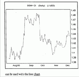
The Line chart
The closing prices are joined to form a line chart. The latter is useful as closing prices are seen as a very important indicator of the trend. The line chart is also a clear diagram as the direction can be identified at first glance. Traditional technical techniques such as trendlines, moving averages and momentum
э: ei interpretation — толкование
э: to forecast - прогнозировать
d3A in conjunction
— совместно
0: advantage
- преимущество
to join
— соединять
э a: at 'first 'glance
— с первого взгляда
Bar Chart
- график отрезков (гистограмма)
Bar Chart
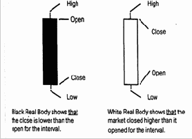
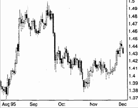
Bar Charts collect and represent price information on a vertical bar. The top of the bar is the highest price and the bottom of the bar the lowest. A tick on the left-hand side of the bar denotes the open price and a tick on the right-hand side is the close price. A HiLo Bar Chart is a vertical line that represent the High and Low prices for an interval. These charts are particularly
tick
e 'Elliottwave
— метка
— волна Эллиота
popular with Elliott wave analysts, where the only necessary information are the highs and lows. The type of chart used by analysts, always comes down to individual preference. The popularity of the bar chart is due to:
Clear representation of data.
Clear understanding of the relationship between the Open and Close (tells you the result of the war between the buyers and the sellers).
Can be used with all other types of analysis.
ae 'Candlestick Chart
to assign
график японская свечка
- называть

Candlestick Charts
As with Bar charts, Candlestick Charts use Open, High, Low and Close price data. The major difference is, that if the close is below the open, that is, if the value of the security has fallen, then the bar is coloured in black. If the Close is higher than the Open, the Bar is left clear or white. These charts are very popular among the Japanese who have assigned various names to the different coloured patterns such as hanging man, hammer and morning star. They are flexible (used on their own or combined with analysis tools). Rises and falls in the market are easy to indentify because of the colour scheme. Small candle reflects that buyers and sellers are almost equally placed. The real body represents the range between the intervals open and close. The thin lines at the top and bottom of the real body are called shadows. They represent the interval's high and low.
(black) coloured body — закрашенный цилиндр
high (low) shadow — с верхней (нижней) тенью
ai 'white body - полый цилиндр

Point and Figure Charts
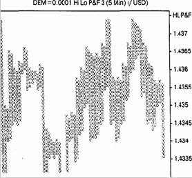
Point and Figure charts are a study of pure price movement with no indication of time or volume trading. This chart filters out insignificant price movements and plots only the rises and falls in market values. A column of "X" denotes rising prices and a column of'0's falling prices.
01
'Point and Figure Chart — график крестиков и роликов
Later columns are displayed to the right of previous columns. X's are only added to a column ofX's if the high is at least one unit higher than the previous X displayed, 0's similarly are only added when the low is at least one unit below the previous 0 displayed. If the current column is a column ofXs, a reversal or a new column of Os will take place only if no new Xs are added to the current interval (that is only if the high price is not higher than the previous high) and the low is at least the reversal number of box sizes below the value represented by the last X displayed.
Point and Figure charts provide very strict rules on how to buy and sell:
to plot - отмечать
later columns — (последующие по времени колонки
э: reversal — перемена направления
>• Buy at the Break of a triple top. >• Sell at the Break of a triple bottom. These charts are particularly useful in a trending market because they keep you in the market. However, in a ranging market, these charts chop you around. A Horizontal Count of the Xs or Os is used for showing a direct link between the width of congestion and the size of the break out from that congestion. For estimating the next high or
to chop around — путать
e to 'estimate — рассчитывать, оценивать
24
Point and Figure Charts
Point and Figure charts are a study of pure price movement with no indication of time or volume trading. This chart filters out insignificant price movements and plots only the rises and falls in market values. A column of "X" denotes rising prices and a column of'0's falling prices.
Later columns are displayed to the right of previous columns. X's are only added to a column ofX's if the high is at least one unit higher than the previous X displayed, 0's similarly are only added when the low is at least one unit below the previous 0 displayed. If the current column is a column ofXs, a reversal or a new column of Os will take place only if no new Xs are added to the current interval (that is only if the high price is not higher than the previous high) and the low is at least the reversal number of box sizes below the value represented by the last X displayed.
Point and Figure charts provide very strict rules on how to buy and sell:
'Point and Figure Chart — график крестиков и ноликов
to plot - отмечать
later columns — (последующие по времени колонки
э: reversal — перемена направления
Buy at the Break of a triple top.
Sell at the Break of a triple bottom. These charts are particularly useful in a trending market because they keep you in the market. However, in a ranging market, these charts chop you around. A Horizontal Count of the Xs or Os is used for showing a direct link between the width of congestion and the size of the break out from that congestion. For estimating the next high or
to chop around — путать
e to 'estimate — рассчитывать, оценивать
low target, after a consolidation phase you must take the largest (the most) Xs or Os in one horizontal line (usually near the middle). Multiply the number of boxes in this line by the size of the reversal, then add this number to the point where the break out occurs. The Vertical Count, the count from top to bottom, is a measure of volatility. One must measure the beginning of the break out to when congestion begins then. > multiply the number of boxes in this line by the reversal size and. >• add this to the point where the next break out occurs.
target
break out
to occur
— контрольная плановая цифра предполагаемая цена
— точка прорыва — случаться
Exercises
Ex. I. Put questions to the underlined words.Ex. 2. Read the text and translate it.
Ex. 3. Discuss the pros and cons of the bar types of charts.
Содержание